Thursday, March 29, 2012

Bathing Beauty, Part II: Inspiration Strikes

If you haven't already, check out Bathing Beauty, Part I: Before Photos for a list of things I dislike about our current bathroom and, you guessed it, the before photos.  Our summertime bathroom renovation plan is getting closer!  And that means it is time to post inspiration photos I have gathered over the last few months.  Oh, who am I kidding?  I've been scouting out inspiration for this project since the week we moved in! 

It all started with this bathroom I found with a google search:

I really like this bright, open and airy coastal cottage bathroom. Photo by Deborah Whitlaw Llewellyn for Coastal Living. 

Next I came upon this beauty:

I love this all white bathroom.  All white can feel sterile, but this bathroom is warm and relaxed.  Photo by Jen Ross.

The next inspiring photo I found comes from Pinterest.  I can't find the source of the original photo, but this website offers the designer and photographer names (see caption under photo).

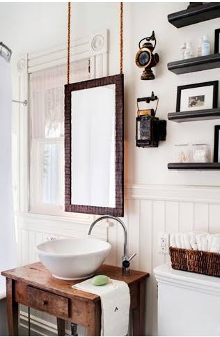
A weathered wood table lends a rustic feel to this otherwise cottage-style bathroom by designer Antonio Martins.  Photo by Drew Kelly for CA Home+Design.

The overarching similarity in these three bathrooms is a white palette with wood and metal tones thrown in for an unmistakable relaxed earthiness.  As with everything else, I have to put my spin on things and the bathroom is no different.  So without further ado, here is an inspiration board I put together:


1. This is the American Standard Studio Above Counter Sink.  I love sinks that sit on top of the counter and shallow is the way to go as we never fill the sink with water.

2. This curvy faucet from Elements of Design balances the straight lines of the modern sink.

3. The Tresham Toilet from Kohler is a beauty, but after reading something on another blog, Young House Love, I may consider purchasing an American Standard instead.

4. This bathtub looks exactly like ours and is here to represent getting ours refinished.  Hopefully there won't be any hiccups in that plan.

5. These Pfister shower valve knobs are what we already have in our bathroom and we love the style.  We'll be replacing the broken and stained knobs with these from Lowe's.

6. We're thinking of going with a deep and vibrant coral color for the towels.

7. and 8. White subway tile from Home Depot will cover the shower walls up to the ceiling.  We will install a thin, black line with these tiles from Lowe's.

9. This Crate and Barrel Pavillion [Sic] Black Wall Mirror is a dead ringer for a mirror I found at DD's Discounts for $30 a few months ago.

10. This vanity from the Sept. 2007 issue of Canadian Home and Country Magazine has inspired Aaron and I to build a glossy, black vanity of our own.  Ours will have two drawers in the apron and only one sink in the middle.  We will use glossy, water-sealed butcher block for the counter top.

11. We are thinking of hanging two of these Laboratory Glass Pendants by Shades of Light on either side of the mirror to achieve the best lighting possible.  (That's one of the only things right about our bathroom in its current state.)  Pendant lights hung along the sides of the mirror light the face without casting too many shadows.  The clear glass will keep the pendants from looking too heavy.

12. This is our preliminary choice for the wall color.  It is Feather Gray by Behr.  If it looks too drab once we paint then we'll spring for something else, but we're hoping that the taupe-y lavender tones stand out nicely next to bright white tile and trim.

13. Last, but not least, are these 1" white hex tile floors from Merola.  We've read that matte tile picks up every little mark so we'll find glossy hex tile when we really start shopping around.  We know it's out there!

One other thing I want to mention is that because we're opening up the vanity, we have plans to build a cabinet for above the toilet to add back a little of the lost hidden storage (rather than open baskets on shelves under the sink).  This is my inspiration for that cabinet.  Ours will probably be black or white and I hope I can find a deep coral fabric to back the door with like Emily did below.

Emily and Erick Henson's Bathroom featured on Apartment Therapy.  Photo by Bethany Nauert.

Did I say one more thing?  I meant two.  We may also put up something that evokes board and batten (see below) or bead board (see photo above) walls for the non-tiled portions.  Check out this simple project!  The original image is from HomeGoods Blog, but they don't permalink their projects so you can slog through to find it on your own time.  I found it for anyone who is interested; it was posted on July 31, 2011.  If I remember correctly, the homeowners found 1" x 4" mdf boards at their hardware store, painted them, and glued/screwed them to the wall to achieve the board and batten look.


That's it for now.  I can't wait to get started on this project!  I'll keep y'all updated as it unfolds!

Monday, March 26, 2012

Bathing Beauty, Part I: Before Photos

As many of you know, I can't wait to demo our only bathroom.  So many people who see it knowing that I want to redo it say something along the lines of, "Oh, that's not so bad."  Well, guess what?  I think it is awful.  I will now detail some of the changes it has gone through since we moved in a year ago.

Here's a picture of it the day we moved in.

April 2011
The first thing to go was the frosted glass door with see-through flowers.  There is nothing I hate more in a bathroom than a sliding shower door.  Not only am I opposed to the look of them, but they make me feel so boxed in.  At least a shower curtain moves when you elbow it!  (Also notice the shower curtain rod hung above the door.  See?  Even the previous owners didn't like the door.)  So, after much complaining, I decided to take matters into my own hands and one day while Aaron was at work I unscrewed it and hefted it out to the garage.  I peeled away as much of the caulking as I could and called it a day.

The next things to go were the curtains.  The teal/gray floor tile is leftover kitchen tile and I'm guessing, since it doesn't match anything else in the bathroom, the previous owners wanted to tie the floor in with matching teal/gray curtains.  Not what I would have done, but the curtains were easy enough to remove, so down they came.


September 2011

 Here is a picture five months after we moved in.  Notice the new shower curtain (since replaced with a clear curtain) and the absence of window curtains.  The next change was part of a whole house spruce up.  We had new windows installed and rather than replacing the old casement window with a new casement window, we opted instead for a double-hung window with the same privacy glass (the pattern is called smooth-rough, but also sometimes goes by the name Flemish Obscure) as the old window had.  The old casement opened into our backyard and when it was open you could see right into the bathroom.  With the double hung window we can open it from the top down when guests are over and we have the other windows open so the bathroom remains private, but still breezy.


March 2012

That brings us to the current state of things.  Let me give you a list of a few of the things I really dislike that still remain.

1. 'Lemon Meringue' Yellow and Forest Green tiles.  Don't get me wrong here, I love vintage tiled bathrooms, just not when the colors clash so badly.  Some of them are cracked also.

2.  The extra tiles.  I'm referring to the mismatched tiles that have been thrown in by those looking for a change without any demo work.  You'll be able to see some other extra tiles in the shower in photos below.

3. The lighting.  They are fake crackle glass balls hanging from rusted chain and with decaying ground wires. (Sounds safe, huh?)  So many people like these upon getting 'the tour', so I guess to each his own.  Two people have already asked for them when we take them down.

4. The almost-there paint color.  I call it "Muted Highlighter".  It's hard to see in the pictures, but the paint color is just the wrong color.  Someone tried to match the tile.  His or her eyesight must have been pretty horrible because he or she made a bad decision. 

5. The plywood vanity.  Enough said.

6. The tub that got drenched with acid and scoured with steel wool and now has grey speckles.  You know how bathtubs, when clean, tend to sparkle and shine?  Ours doesn't.  Don't be deceived by the front facade; it wasn't cleaned in the same manner as the inside.  Just wait for the pictures on this one.

7. No towel bar for the hand towel.  There used to be a towel ring over by the toilet (which is behind the door).  I took that out before the furniture was even moved in.  Gross.

8. The door swings the wrong way.  It opens in to the bathroom, which is correct, but instead of opening against the wall, it opens against the toilet.  Inconvenient to the max.  Especially for the two of us who don't close the door when we use the bathroom (unless we have company, of course).  Did I go too far with that?  Oh well.

Now let me illustrate some of these in pictures.


Those are the extra tiles I spoke of, the toilet behind the door, damage from taking down the shower door, the plywood vanity with a dark stain, various cracks in the tile, and the non-shiny bathtub.  I would like to put in a disclaimer here that we do clean our bathtub.  It holds on to dirt because it has no finish.  Those marks won't come off.


I hope some of you will better understand why I want to gut the sucker now.  We're hoping for a Summer 2012 renovation.  I'll keep y'all posted along the way with updates and pictures as they happen.  Next up: Inspiration Strikes!

Monday, March 5, 2012

An Open-Shut(ter) Case

Our new shutters!

Months ago I had the idea to add shutters to the two windows in our garage.  They face the street and while they don't attract a lot of attention, I thought adding shutters would be a fun way to add a little color to the front wall of our house.

Cottage-style board and batten shutters.
I looked at a lot of pictures both on Pinterest and with Google image searches and decided to go the cottage-y route with board and batten shutters.  I also decided this


was a simple project Aaron and I could do on our own.  Board and batten shutters, for those who want to know, are simple, vertical wooden slats with two horizontal slats holding the vertical slats together.  While searching for inspiration I also came across a very informative website about proper and improper sizing and installation of shutters.  While our shutters won't be functioning shutters, I still want them to be the proper proportions for our windows. 

I didn't want to spend very much money on this project so I chose to use cheap cedar fence pickets for construction and the leftover bright plum paint (Martha Stewart Plum Pudding color-matched to Behr paint) we bought for the front door and side gates for color.  I only had to buy seven fence pickets at about $1.50 a piece so my total was only about $10.  Pickets come in very select sizes so this meant the shutters wouldn't be the perfect size for functionality, but the small price tag far outweighed my desire for correctness.

The wood was very wet when we purchased it so we cut it to our desired length and screwed the pieces together, but waited to paint until everything had dried out.  While the wood was drying we also bought new windows so I decided to wait to do anything else for this project (aside from painting) until the new windows were installed.

Constructed and drying.
Primed and first coat of paint.

Once the new windows were in and the wood had finally dried out I was able to paint. Two coats of primer followed by two coats of paint did the trick as far as prepping the shutters for installation and after a week of dry time for the paint, Aaron and I were able to hang the shutters in under 30 minutes.

Our house before, without shutters. (Excuse the poor lighting.)


Our house after, with shutters!

We love them and the neighbors have already complimented us on them as well.  I think it just gives that 'finished' look to the front of our house.  It brightens up a bland wall and closes some of that blank space that just looks lonely.  To quote myself during the installation process, "It's like we've added eyelashes and mascara all at the same time!"  It is simple projects like this that make me so happy.  We've added some major curb appeal (at least in our eyes, which is the important perspective) for only $10!  You can't beat that!

Early on I had considered adding hinges and hooks for that look of functionality, but once the new windows were in I realized the windows weren't butted up against a solid frame, but were instead floated in place leaving an open space surrounding the actual window.  The open space is covered by a vinyl front, but there is nothing solid to screw the hinges into, so that idea went out the window.  (Ha, no pun intended, but consider it enjoyed!)

All in all, we're very pleased and can't wait to tackle our next project!